CASE STUDY
ALTiO
Exploring new accessible experiences through creativity
An accessible social media app that reimagines expression by connecting the Deaf and Hard of Hearing community with hearing artists’ interpretations of audio
UI/UX, Branding
Awarded Best Concept, Most Novel Idea, Greatest Social Impact, Best Poster, Second Overall Project
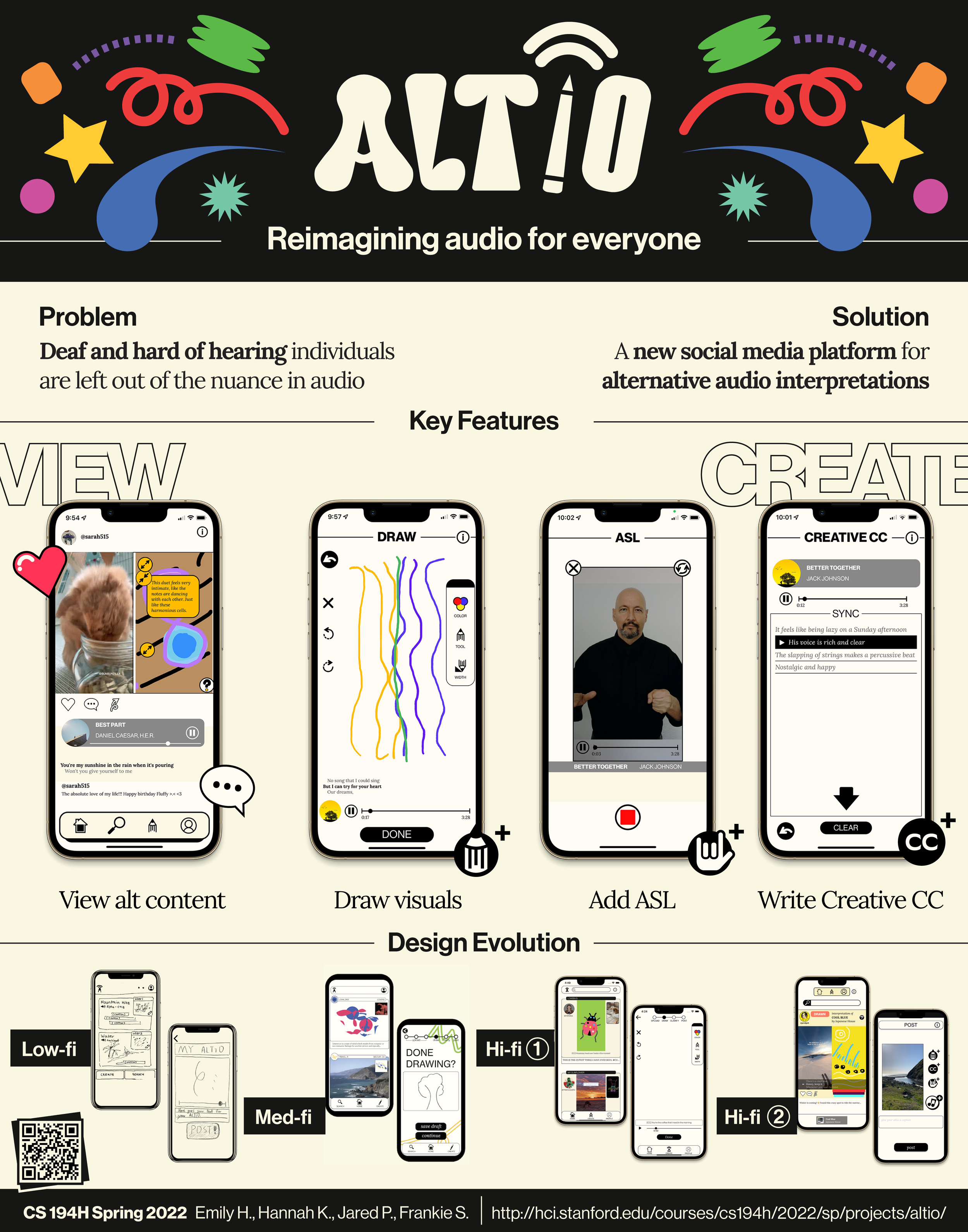
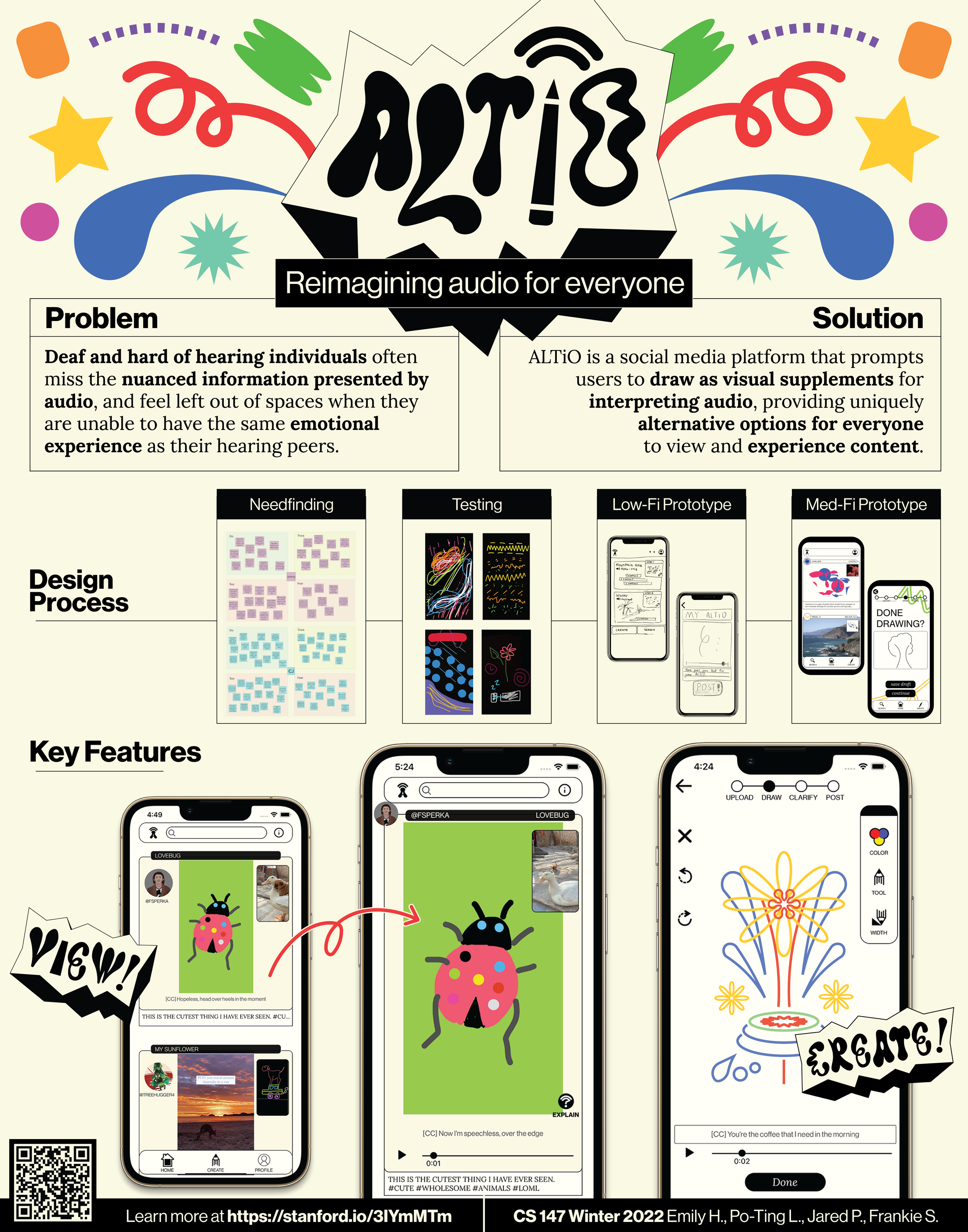
AUDIO FOR EVERYONE
AUDIO FOR EVERYONE
Watch a walkthrough of our final prototype.
How could you describe a feeling?
***
Deaf and Hard of Hearing individuals watch videos and listen to music, too. But, they can feel excluded from spaces where they can’t experience the same emotional contexts as their hearing peers. Reading between the lines of audio, we found a need to be included in pop culture, non-verbal cues, and feeling—atmosphere, vibe, sensation. Our team set out to make an interactive platform to reimagine the nuance represented in digital audio for the Deaf and Hard of Hearing community.
ALTiO was born in the Accessible Design Studio in Introduction to Human-Computer Interaction Design. I worked as a UX researcher, UI designer, and brand designer to ideate, prototype, and visualize the world of a new accessible experience. I conducted interviews, designed experience prototypes, sketched wireframes, built components and screens, and established a visual language.
OVERVIEW
ALTiO (from alternative & audio) is
An app that gives users tools to create interpretive art translating audio into visual
An app that gives Deaf and Hard of Hearing people a social media feed with creative interpretations to expand on emotional context they’re missing from audio
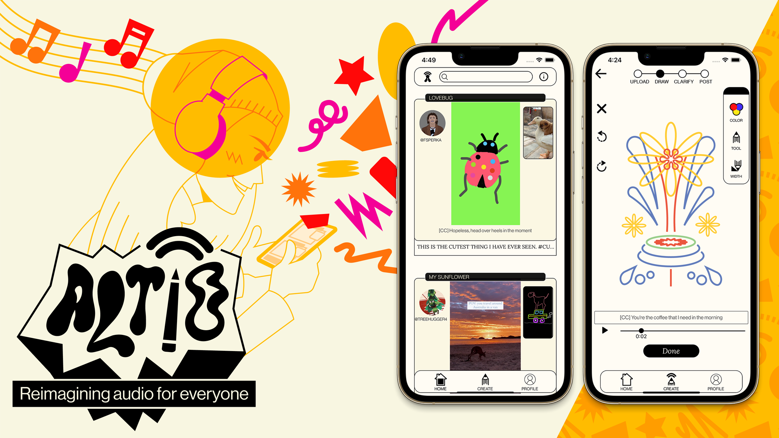
ALTiO allows users to supplement posts with visual footnotes that conveys these more nuanced emotions in a visual way for users in need of alternative audio. Users can explore various posts by artist, genre, and profile to discover and engage with unique artistic content. By introducing a new, personal layer of shared interpretation, ALTiO establishes a new conversation and a connected community.
UNDERSTANDING
Our team began the needfinding process by speaking with individuals who are members of or adjacent to the Deaf and Hard of Hearing (D/HH) communities. [Def.]. Our interview participants ranged from Deaf individuals, Hard of Hearing individuals, individuals who used hearing aids, and children of Deaf adults (CODA).
We set out to understand how D/HH individuals experienced entertainment, particularly digital media, and used technology, accessible or not. We learned that D/HH people often found closed captioning lacking, whether it be from lag, inaccuracy, or absence altogether. Understandably, lyrics were a priority for D/HH people when it came to music, but we were surprised to learn that it was a way to participate in pop culture. Our D/HH participants felt frustrated when the media they wanted to enjoy, like songs or videos, excluded them from more than just audio.
IDEATING
Themes we took away from our first interviews included the importance of visual clarity; inadequacy of current accessible features like captioning; and the need for more representation of Deaf culture. Friction arose in expression of wanting independence versus wishing the onus of accessibility were placed on hearing individuals. Among all of our interviews, the throughline was inclusion.
We moved forward with the understanding that sight and sound were not the only dimensions to take into consideration when tackling D/HH exclusion. Descriptions were often fact, not feeling. The team began to consider: what if alt. text could be more than text?
EXPERIENCE PROTOTYPE
We designed an experience prototype around the assumption that unique modes of audio interpretation could add an unexplored layer of nuance or meaning to content. Our participants took turns listening to and drawing an interpretation of “how a song made them feel.” Afterward, the artist would show their drawing to a participant who had not heard the song. The audience then shared their thoughts on the drawings, eventually including the artist, and finally listened to the audio together.
Our interviewees—strangers and self-proclaimed non-artists among them—loved both sides of the process. During one of our discussions, one artist was happily surprised: “She got more out of [my drawing] than I even realized was there.”
LOW FIDELITY DEVELOPMENT
The team pursued a community-oriented solution because of the liveliness of this experience prototype. We began to explore a native social-media app that hosted content supplemented by interpretations. Hearing users would create artistic interpretations of content, then D/HH users and hearing users alike could view the content supported by new creative expressions.
After sketching out our wireframes, we built our low fidelity prototype in POP by Marvel. We mapped out how users would upload posts; create drawings; add captioning; interact with posts; and explore the content feed.
HIGH FIDELITY DEVELOPMENT
We built our first fully functional prototype using Figma and the React Native framework in Expo. This version focused on improved signposting and narrative framing. This included onboarding; tutorial pop-ups throughout our main user interactions; progress bars; and directly centering the D/HH community. We required video content (instead of allowing audio-only uploads) in order to include our D/HH users in every potential post.
Watch the demo video presented at the Industry Project Fair.
ALTiO was awarded Best Concept, Most Novel Idea, Greatest Social Impact, Best Poster, and Second Overall Project out of over fifty teams. Our team decided to continue developing the app as a User Experience Design project with a focus on refining the novel interface technology.
HIGH FIDELITY REDESIGN
We tested our high fidelity prototype with D/HH participants. Our usability studies showed that users needed more extensive guidance with the initial learning curve of our concept; that we needed a stricter design system for components and styling; and users required more feedback and confirmation while creating posts. Additionally, after heuristic evaluation, we redesigned our home screen to better match competitors like TikTok, and expanded community features (namely, account creation and user profiles).
Participants were confused about post interaction: swapping between video and interpretation made the experience feel disjointed. (Think of only seeing a painting as either the left half, or right half. Not very immersive.) In our redesign, each post on the content feed retained the ability to expand either interpretation or video. But now, the standard was a simultaneous viewing of original video and interpretation.
The new version of ALTiO introduced our “creative closed captioning” feature as a new way to interpret audio, a way for users to explore subjective lyrics as a means of storytelling.
Based on feedback from our D/HH participants, we included the audio interpretation option of American Sign Language (ASL). ASL is essential to D/HH culture; now we could address an initial goal of uplifting D/HH culture and educating hearing people about its significance. D/HH users were now able to contribute interpretations.
VISUAL IDENTITY
ALTiO is a celebration of the sensory experience and its ability to build bridges. It felt authoritative to define a visual language for this abstract concept when the goal of the app was subjective interpretation. Additionally, how could we feature art while prioritizing legibility and usability? My goal became retaining our roots in imagination while conveying the high-level concept as clearly as possible.
In the spirit of accessibility, we wanted to emphasize that emotion wasn’t just for artists, not just for hearing individuals, but for everyone. This was to be a space for creativity that wouldn’t crowd out users. I looked to the shared experience of a dream to create a vision of something unreal, eclectic, loud, but inviting and inspirational.
I selected a color palette that harkened to a page of a sketchbook. Deep cream (not just off-white) and ink gray were the foundation of our brand, stripped bare to something clean yet warmer than just another everyday app interface. By invoking the feeling of a blank page throughout all of our screens, not just our creation features, the app brimmed with a feeling of untapped potential.
Neue Haas Grotesk was our workhorse typeface and way to temper the cuteness and quirk of our app with a bold driving force. Our high-level onboarding went over some heads, but this recognizably graphic typeface reframed the project of the app as a modern call to action. The serif Lora handled our breadth of body information and guidance with a playful legibility. The type system works as a disruptive proclamation to partake in the project as something beyond an everyday app
I was adamant on only employing flats: no gradients. This was a stark contrast to every other app interface being created in our course. If shading made our buttons feel literally tactile, it would detract from our goal of being born from imagination. Intentionally sacrificing dimensionality kept the visual language of ALTiO suspended in graphic unreality—a distinction from the real video and audio being presented to a user. Now, the aesthetic and content wouldn’t compete with one another, but would be operating as layers of a whole.
I created a modular system of “emotional ephemera”: sweeping droplets, globs, starbursts, etc. using Adobe Illustrator.
These impressions existed as literally undefined but tonally provoking—afterimages of a dream you can’t remember but you feel a certain way about. Most importantly, I designed these with the app’s interpretive drawing function in mind. I wanted each of the assets to live in the same world that users were creating in: all of our flourish had to look like it could be made using ALTiO’s tools. Over-designing whimsical ephemera could degrade the assets to ambitious clutter, or discourage less artistic users.
I first designed our logo entirely from freehand sketches, then pared the energy down to exist more reasonably in the mobile app space. Familiar forms create a rhythmic throughline between the letters. These sharp angles and ballooning slopes tug at each other to build kinetic energy. I stretched the design vertically to inspire something loud. I balanced the “ALT” half of the type with a slanted “IO” to draw attention to our unique name.
REIMAGINATION
I cherish this project as my first foray in collaborating with engineers and other designers, needfinding for differently-abled communities, and creating something to be used. Before this, I mostly worked alone in advertising and apparel—which, I came to learn, were closer to statements than conversations. From rooting out pain points from underserved communities with empathy; explaining my design strategy and understanding other perspectives; and reframing accessible compromise as democratization, every step of the way was a conversation. Checking in, critiquing, reaching out, and brainstorming were all new methods in service of my ultimate goal as a designer: conveying meaning effectively.
The project of ALTiO relies on a great deal of trust between us developers and our users. The outer workings of ALTiO are pretty rotely didactic for this reason: the up-front mental load is your briefing while we give you the tools, and after that we’re letting you run loose with your ideas. This understanding—that this transaction of knowledge didn’t necessarily have to be as seamless or intuitive as possible to create a satisfactory experience—made me rethink my approach to instruction in design.
Learning is work. Practice, recall, application: all work. Is work a bad word? Many designers think so. But friction, discovery, exploration, and reward have all become key tenets of the way I design user interaction. An inclusive world is something worth fighting for. Joy is something worth working for. In fact, the work itself is meaning-making. My job now is figuring out how to make the work feel joyful in and of itself.
Because of ALTiO, what I’ve been setting out to do as a designer is reframe systemic issues by empowering users. Yes, things can be different, and together we can reimagine the agency to make a difference. Design might not be enough to fix the world alone, sure, but it can give us the power to build something new.